


April In Design
April In Design
Design Monthly No.04

Design Monthly is a monthly newsletter from Moodboarding with Beth, celebrating the month in design and creativity with four projects that I’ve loved.

RSPCA // JKR
The RSPCA is celebrating 200 years of working to help animals live fairer and better lives. This anniversary inspired a change in strategy that aligns with the growing challenges faced by animals worldwide and reflects the breadth of the charity’s work today. The design team at JKR directly engaged in the RSPCA’s work, visiting farms and rescue centres, working with animal rescue officers, and participating in immersive workshops to gain a comprehensive understanding of the organisation and its work.
The new slogan, "Inspire everyone to create a better world for every animal", reflects the organisation's values and resonates with supporters. The fresh identity is brimming with animal iconography, each location given its own title and regional mascot reflective of their local wildlife. A custom typeface was designed for use across the brand, and its signature blue has been updated to be brighter and bolder. Incorporating animals into the design system puts their redefined purpose front and centre, making the brand feel warm and welcoming, tapping into our nation's love of animals by inviting us in and inspiring us to care.
Studio: JKR // Brand: RSPCA


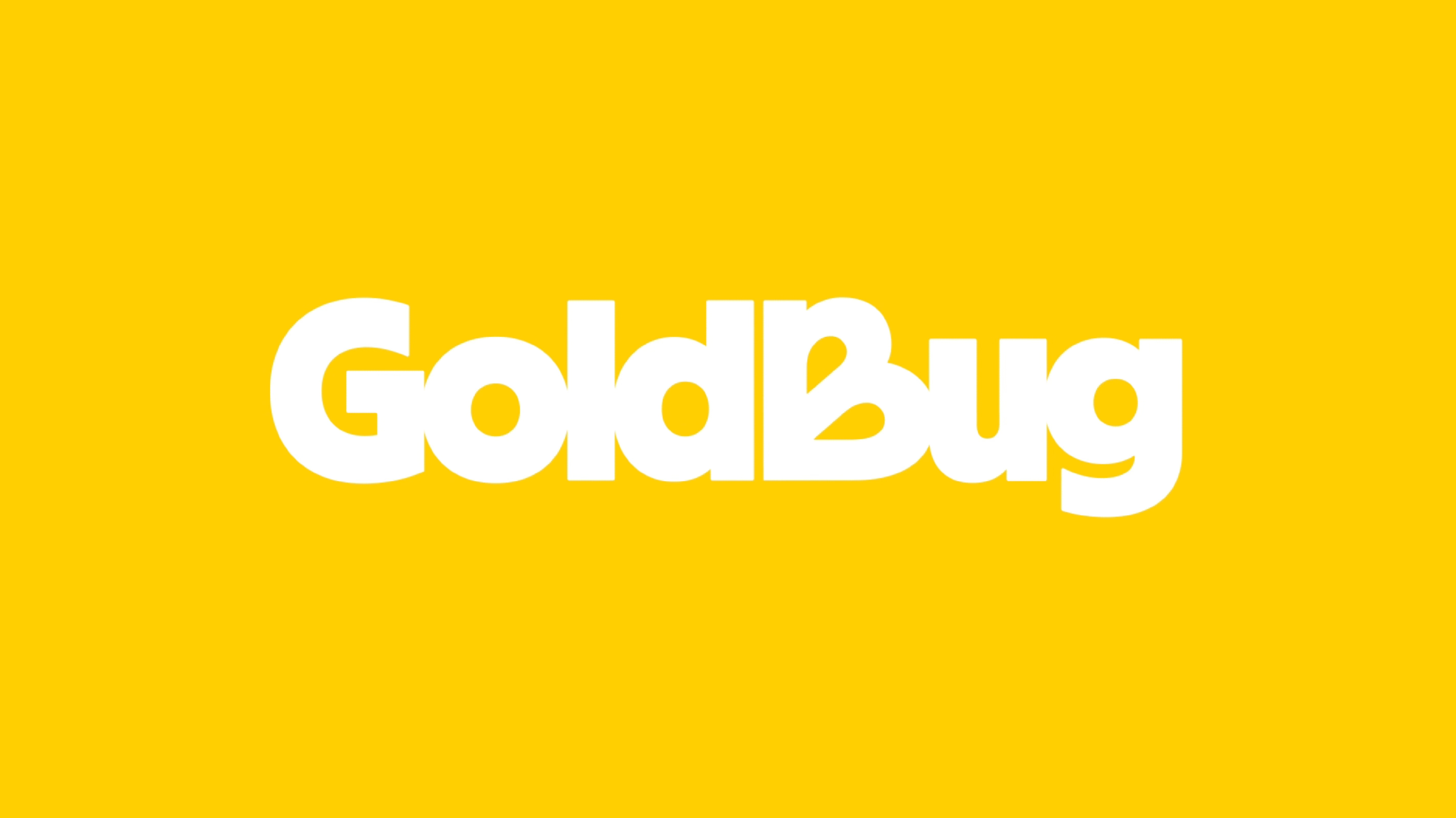
GOLDBUG // SCORPION ROSE STUDIO
GoldBug is a woman-owned distributor of infant and children’s accessories. The brand worked with Scorpion Rose Studio to help consolidate its various sub-brands into one cohesive identity.
Their collaboration repositions Goldbug as a trusted companion that supports children and parents on their journey of growth and discovery, emphasising authenticity and everyday adventure. Together they crafted a visual identity that resonates with modern parents, reflecting the brand’s commitment to quality and reliability while expressing optimism and playfulness. The logo pays homage to their original butterfly emblem, carrying the Goldbug’s legacy onwards. Joy is reflected through every touchpoint, from print and packaging to digital applications, supported by colourful illustrations and candid photography.
Studio: Scorpion Rose Studio // Brand: Goldbug


CRUMBL // TURNER DUCKWORTH
Crumbl was founded by two cousins who opened the small cookie business in Utah which has since expanded into more than 800 stores across the USA. Turner Duckworth was tasked with designing a fresh identity that suits their new position while retaining Crumbl’s grounded mission to bring friends and families together over a box of the best cookies.
The visuals were developed around Crumbl’s iconic pink boxes, incorporating their distinct colour and shape into the new identity. A customised variable typeface, Crumbl Sans, was created to span the brand experience and sit perfectly within the delectable “Crumblverse”. This beautifully illustrated world brings the brand’s stories, community, and bakers to life, and pulls the brand together across platforms. The design captures the spirit of the brand in a polished aesthetic that produces sheer delight and encourages community.
Studio: Turner Duckworth // Brand: Crumbl


PERELMAN PERFORMING ARTS CENTRE // PORTO ROCHA
PAC NYC is a contemporary performing arts space built on the historic site of the World Trade Centre in Lower Manhattan. Before opening in 2023, the theatre worked with design agency Porto Rocha to establish PAC as a cultural beacon where people from all walks of life are invited to gather, eat, drink, and experience the arts.
The design team looked to the building's unique cube architecture to create an identity system, adapting the shape into a simple square, used as an expansive framing device that unites the visuals across touchpoints, from the logo to the advertising campaign and marketing materials. This frame offers the public a glimpse into PAC’s diverse programming, the typography developed for mass appeal and adaptability, and to reference New York’s iconic street signage. The colour palette and photographic direction were chosen to highlight diversity. The structure is bold and accessible, accentuated by simple, straightforward messaging that welcomes everyone in.
Studio: Porto Rocha // Brand: PAC NYC


DISCOVER MORE
TALBOTT & ARDING // JESSI BRATTENGEIER A cheese and provisions shop with a premium feel that celebrating craftsmanship and collaboration.
MATHESON FOOD COMPANY // WEDGE The foodie brand embracing the basics of classic packaging design.
THE SMEAR CAMPAIGN // AMV BBDO A disgustingly brilliant campaign against raw sewage dumping.
COPPAFEEL // LIVITY A playful and inclusive rebrand for the UK’s only breast cancer charity aimed at young people.

As always, thank you so much for reading, sharing, commenting, subscribing, and simply being here. If you enjoyed this article please give it a like and a comment (I love hearing from you). You can read more monthly design pics below. See you in June!


